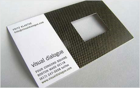
Do you know what makes a business card effective?
Is it originality? Is it legibility or simplicity? Perhaps it’s how your card prompts the recipient into contacting you. A clean, uncluttered design shows that you care about appearance and in my opinion immediately sends out a professional vibe.
First and foremost, your card must clearly show your contact details. Before anything else that’s the number one priority. Even if your card is poorly designed, it must allow people to contact you. That’s kind of a no-brainer, but you’d be surprised how many cards hide the contact info away behind some over-indulged colour scheme or illegible typeface.
Size deserves a mention. If your card doesn’t fit into a holder or wallet it’s not likely to be kept close-at-hand.
Should your promotional piece have a gimmick? Here’s an example of how some cards aren’t printed on actual card stock.

It belongs to Poul Nielsen, a certified personal trainer and fitness consultant in Toronto, Canada. Just reading Poul’s name and job title is a light workout in itself! From his website photo Poul looks like a top, friendly bloke. It’s a shame his online personal trainer presence isn’t as unique as his stretchy business card.
I contacted Poul to ask if there was anything printed on the reverse, and there isn’t.
You want your contact details to be obvious without any catch. I have divided loyalties with this card. It’s original, fits excellently within the industry, but it doesn’t make the information apparent at first glance. What happens if the prospective client only has one arm, or is missing thumb? Of course he could always hand this card out personally and have a back-up for such occurences.
How much do you think conventions should be challenged and does it depend on the industry?
Take a funeral director for instance. I tried to think of a profession where you want to be subtle in your sales pitch. Being subtle doesn’t mean you have to sacrifice good design for a ‘plain Jane’ finish.
A funeral director wants to sell his / her most expensive headstone or coffin. Why not print the card with a subtle marble or oak-effect behind the text? Gloss laminate the substrate for a smooth finish perhaps?
Mark Boulton was recently asked, “What makes a good business card?” and he wasn’t so sure about his response. His readers make some interesting points in the comment section of that post.
One commenter, Zach Inglis, thinks your business card should be, “Clean, crisp, readable, rememberable.” He makes a good summary, even though I’m sure he meant ‘memorable’.
I came across this post about cartoons on business cards. For me, this one depends on the message of the cartoon and the industry being designed for. There were some nice examples though and I’ve shown a few below.


For those interested, I posted a while back about the process behind my own personal business card.
Terry Tolleson beleives that a business card should (at the very least) have three elements on it (in order of importance):
1/ Contact information
2/ Company name
3/ Visual identifier for the company (a logo for instance)
No comments:
Post a Comment